


Today we’re going to talk about measuring Salesforce user adoption. This is what will show your company if your users are actually logging in and working in Salesforce (or not). It will also provide a general overview of what they are doing in Salesforce.
Increasing adoption is going to help your Salesforce ROI, so it’s a good thing for Admins to keep an eye on. There is a free app on the AppExchange, but today, I’m going to show you how to create your own adoption dashboard, which can be tailored to your specific requirements.
Collect Your User Adoption Requirements
First, we need to figure out those requirements. To do this, we need to ask ourselves some questions.
“What are our users supposed to be doing in Salesforce?” This is where your stakeholders, leadership, and management teams are critical. With each team in your organization, sit down and ask: “What do you expect to see from your team, in Salesforce? What are your users supposed to do in Salesforce?”
As Admins, we know there are a few things that Users will probably be doing regularly:
- Logging in
- Editing Records
- Creating Records
Our Leadership team has given us more details during our discovery sessions:
- Creating Opportunities
- Updating Opportunities (particularly Next Steps and Stage field)
- Updating Leads (particularly Status field and converting to Contacts)
- Logging Activities
Create Your User Adoption Dashboard
Using this information, we can build our reports and dashboard. Let’s start by setting up a Report Folder and a Dashboard Folder.
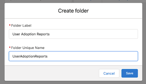
Navigate to Reports -> New Folder -> name it “User Adoption Reports”
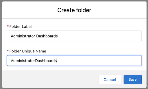
Navigate to Dashboards -> New Folder -> name it “Administrator Dashboards”
User Reports
I mention User reports in a different blog post, but we’ll go into more detail here since this is our adoption dashboard. The first set of reports we’re going to build are our User reports, which will have the following components:
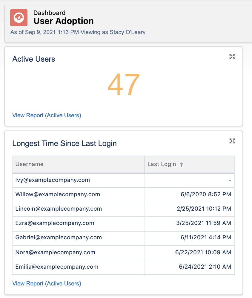
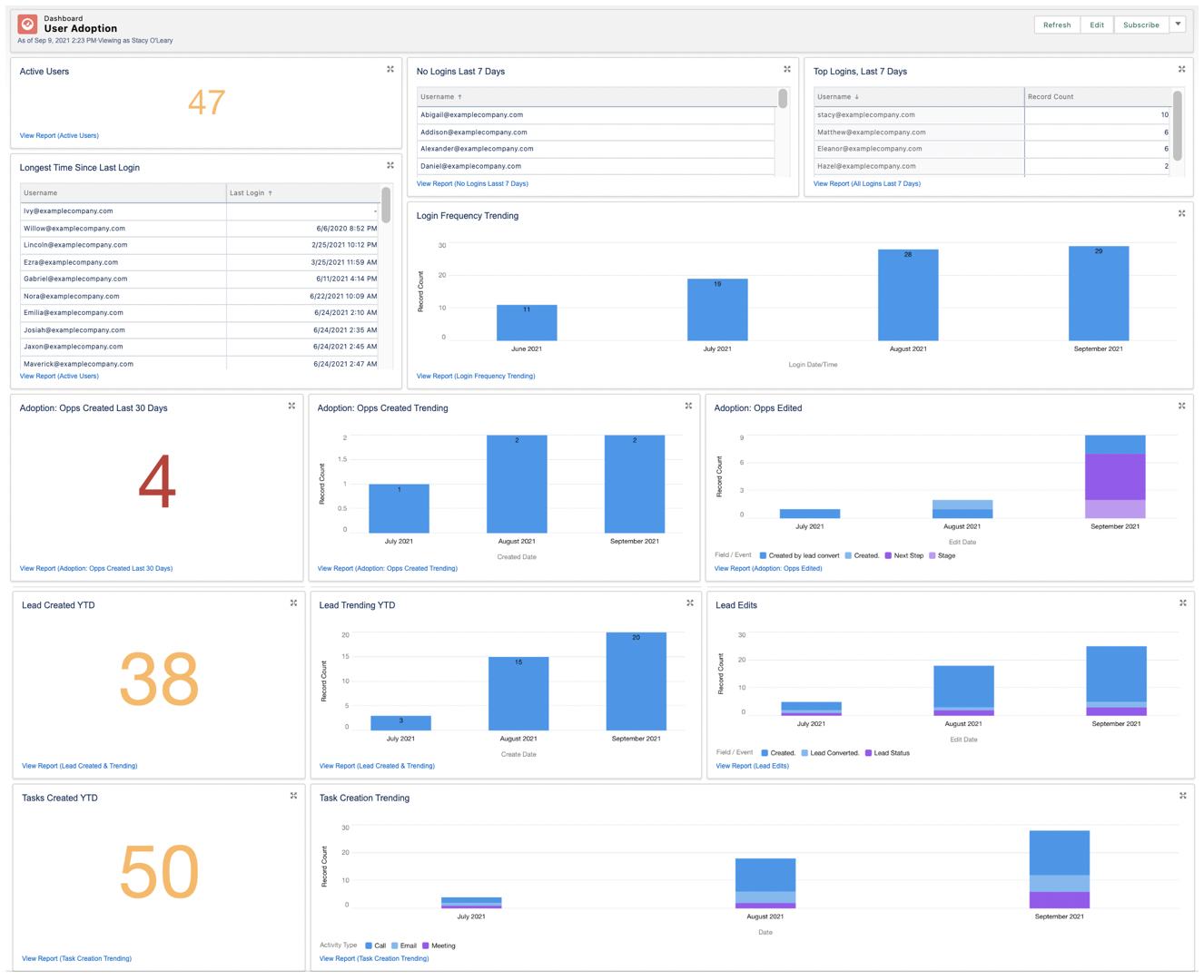
- Number of Active Users
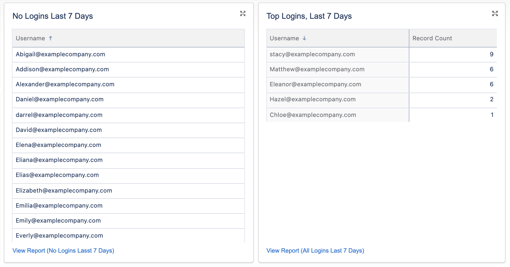
- Users Not Logged in (Last 7 Days)
- User Logins in the Last 7 Days
- Users by Last Login Date
These reports will tell us who is not logging in frequently enough (at least once per day, and at least multiple days of the week). You can adjust these date periods to suit your needs. All of these reports are going to be on the User object.

The most important field is “Login Date/Time”. When you leave this field off your report, you will see each User represented as one row. This is great for reports that just count active Users, or only look at “Last Login”. But some of our reports will be looking at the total frequency. Adding a “Login Date/Time” field to your report will show you every single login by every User who meets the criteria – this is great for seeing a single User login multiple times.
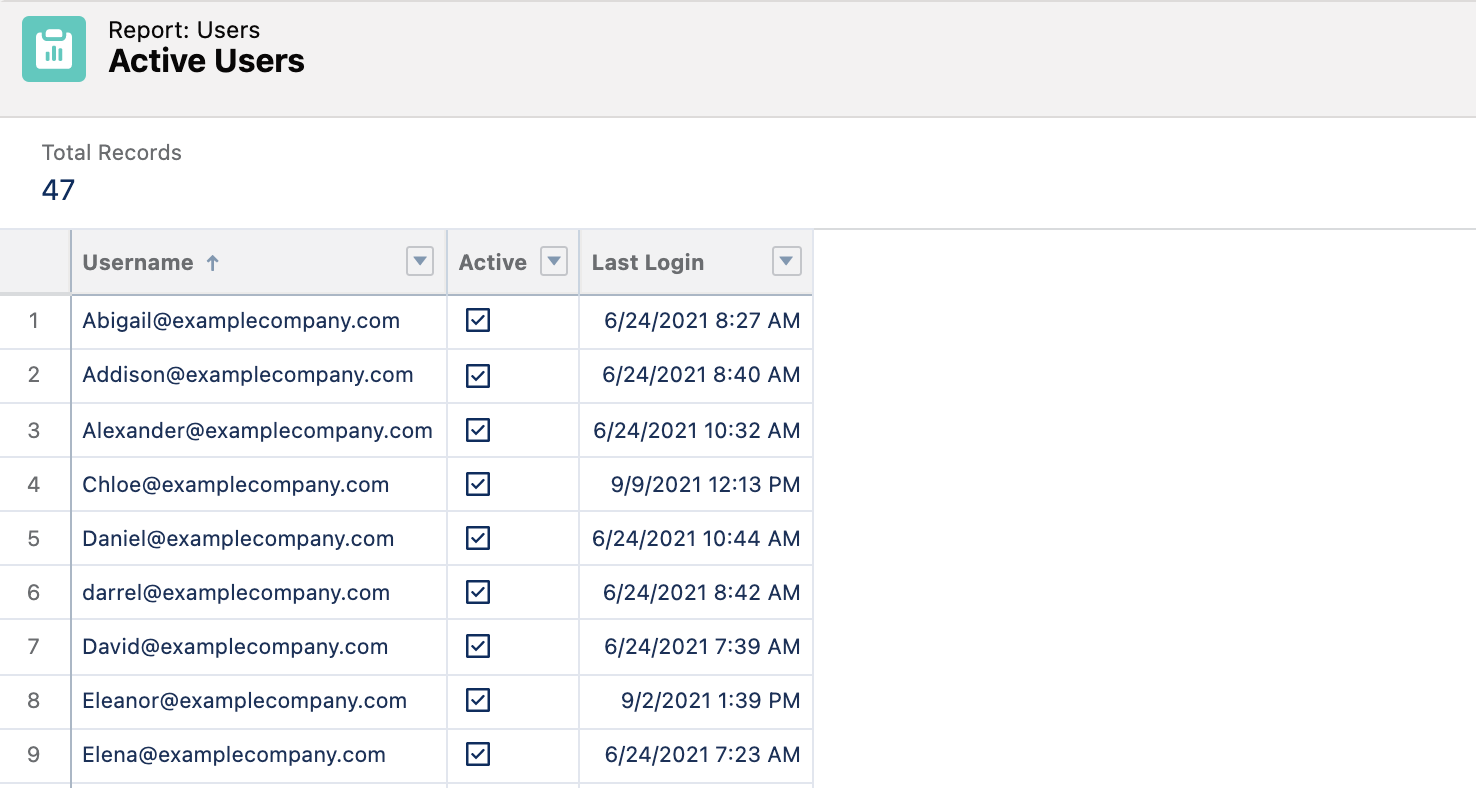
This report only displays the “Last Login” column; it does not include the “Login Date/Time” Column, and each User is represented once.
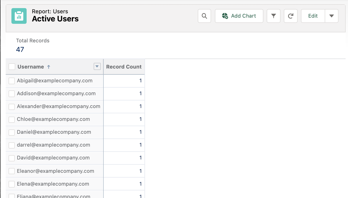
Here is the exact same report (below), but I’ve included the “Login Date/Time” field so that you can see how frequently people are logging in:

Eleanor and Hazel are logging in regularly, but Chloe has only logged in once.
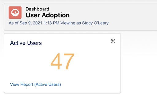
Our first report is just going to be a count of how many active Users we have in Salesforce. We will want to exclude the “Login Date/Time” field because we aren’t counting each login right now. Our only filter is going to be, Active = TRUE, and we will also exclude the auto-created Salesforce users, since these do not count towards our license usage. We’re going to use this on our dashboard, so let’s group by “Username”.

Then we can add this report to our dashboard.
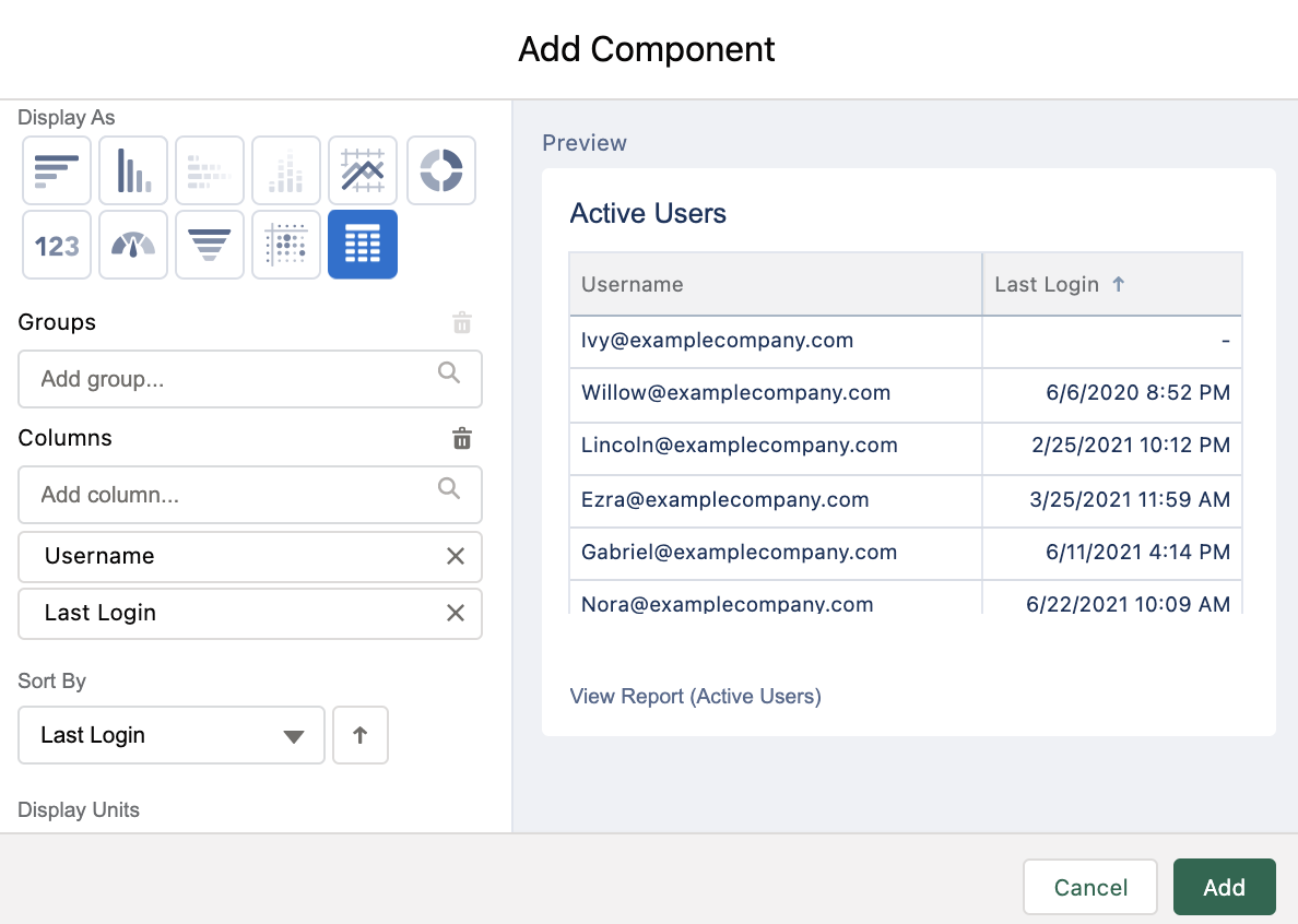
In the dashboard edit screen, we can use this same report to stack rank Users who have gone the longest without logging in.
We can take the report we just created and modify the filters, adjust the columns, and use “Save As” to create the rest of our reports:
- Users who have not logged in during the last 7 days (filter Last Login not equal to LAST 7 DAYS).
- Top Logins during the last 7 days (filter “Login Date/Time equals LAST 7 DAYS”).
Depending on your requirements, you may want to add components for the number of Users per profile, manager, or location. You can also look at login trending over time.

Opportunity Reports
Let’s move on to the records section of our dashboard. Starting with Opportunities, we’re going to look at:
- Opps Created in the last 30 Days.
- Opps Creation trending YTD (Year to date).
- Opps Stage value edited (make sure you have Field History enabled).
- Opps Edited – Next Steps, Stage, Created (make sure you have Field History enabled).
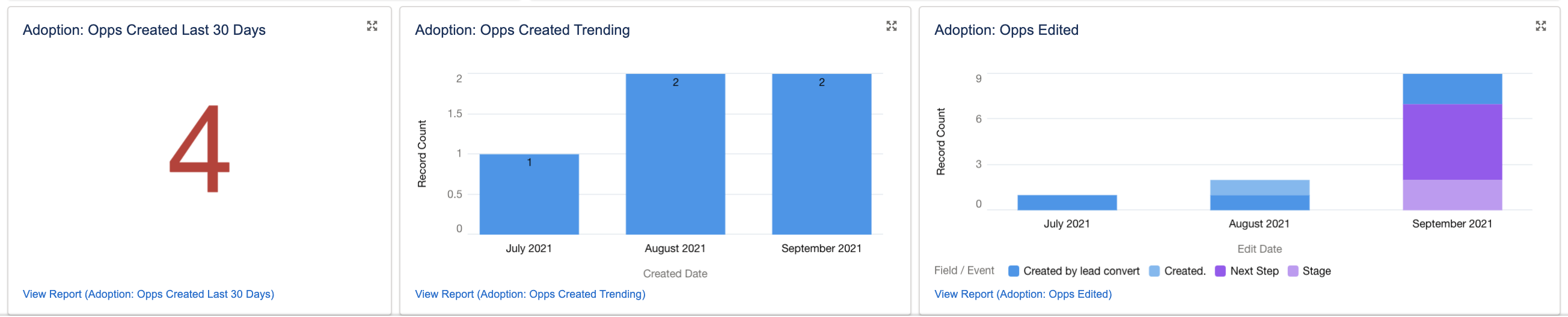
| Report Name | Report Type | Filters | Notes |
|---|---|---|---|
| Opps Created Last 30 Days | Opportunities | Created Date = Last 30 Days | Show as a whole number, or show sum of Amount. Or show number, grouped by Opportunity Owner or Creator. |
| Opps Created Trending YTD | Opportunities | Created Date = This Year | Show as a horizontal bar chart to easily see increase or decrease. Group monthly or quarterly. |
| Opps Next | Opportunity Field History | Edit Date = This Year, Any Stage, Field Event = Created by lead convert, Created., Next Step, Stage | Break these out by action, or show combined, like this example. Horizontal bar chart to visualize increase or decrease over time. |
Repeat this process for other objects in your org (as needed) to gauge adoption. Keep in mind that you can only have up to 20 components on a single dashboard. So, if you have a lot, you may need to break them out by teams/object type.
Lead Reports
For Leads, let’s look at:
- Leads Created
- Lead Creation Trending
- Leads Converted
- Leads Status edits
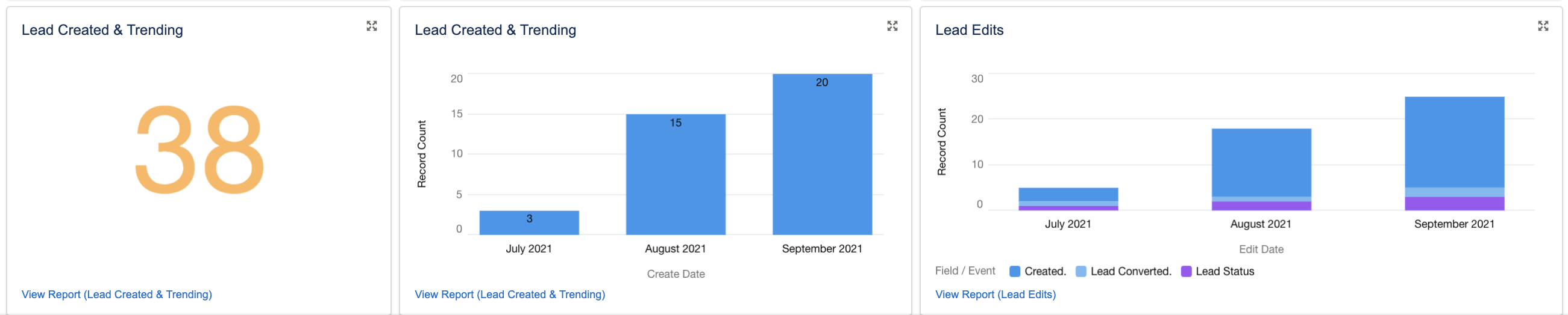
| Report Name | Report Type | Filters | Notes |
|---|---|---|---|
| Opps Created YTD & Lead Trending YTD | Leads | Created Date = This Year | This is one report used to generate two dashboard components. Just displayed as a whole number, then as a horizontal bar chart. |
| Lead Edits | Lead History | Edit Date = This Year, Field Event = Created., Lead Converted., Lead Status | These three edits are the highest indicators of work being done, so these are the three we want to see displayed. |
Activity Reports
If your org uses Activities and you want your Users to do things like log emails, events, or track meetings, this is a great way to see if they’re doing what they are supposed to be doing. After all, the Admin’s stand-by phrase is: “If it’s not in Salesforce, it didn’t happen!”
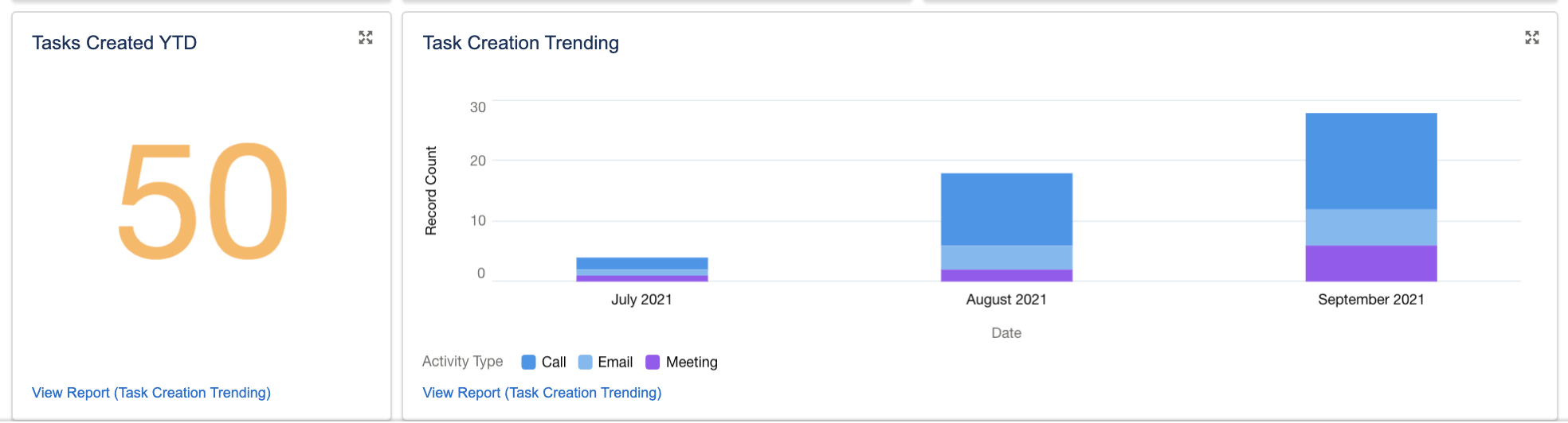
| Report Name | Report Type | Filters | Notes |
|---|---|---|---|
| Task Creation Trending | Tasks & Events | Created Date = This Year | This is one report used to generate two dashboard components. Just displayed as a whole number, then as a horizontal bar chart. Sorting by Type adds valuable detail. |
And that’s it! Our dashboard is complete.
Summary
If you’re working on a new org, you may want to subscribe to this dashboard daily or weekly, and provide additional training for users or teams that are struggling. There are so many options when it comes to user adoption, so I prefer to make my own dashboard for this, rather than using an installed package. Other than the initial “User Login” reports, most organizations’ requirements are unique, particularly if they’re working with custom objects.
One thing to note, though, if you share this dashboard with your leadership team, this is a User Adoption dashboard – it’s not intended to show if your users are doing a “good” job or not. If your leadership team wants to see metrics around data quality, win rates, or pipeline growth, these should be added to a separate dashboard.
Another important thing to remember for this dashboard is dates, as well as real-life human nature. For example, you don’t want to panic if this month shows a sharp drop in logins – it may be the first day of the month, a major holiday, or Users might be on vacation or personal leave. It’s important to not make assumptions.
However you decide to use this dashboard, I hope you can make it successful for your org!
Let me know what you think – do you have any favourite indicators of Salesforce user adoption? Leave a comment below!

Comments: